
Writing For Money: The Corporate And Creative Copy I’ve Written For Other People.
Some of this has cool photos of art that I didn’t make, accompanied by writing that I did make. Some of this might be little long, or a little dry, but sometimes corporate content has to be concise and specific with no time for fun words and images. I do my best, however, and sometimes it can be fun.
In my day job, i helped produce websites (and digital ads, and apps, and software, and games) by collecting images, copy, video, analytics tags, and seo content and putting it all into a templated content management system in a gorgeously designed way.
Usually, the software was built specifically for the company, so no one had worked in the system before, which meant someone (me) had to write a manual on how to use the software.
And then I wrote another manual on the process we needed to collect all the content and organize it before plugging it into the software.
To this end, I usually asked to help test and advise UX/UI if we were building new interfaces, just to reduce the number of steps that needed explaining when we jumped into the CMS.
If all the navigation lists were organized in a natural way for production, and the button labels were well-written (so you knew if you were pushing an image or webpage to “test” versus “live”) then you didn’t have to explain which button to push in the manual!
It’s so helpful to be able to jump into software that doesn’t need documentation for EVERYTHING you need to do, I think. Most companies that make software for a living totally understand this, but if you’re working inside a company that makes, well, money, for example, or widgets or something, they may not think of the little helpful things when building software.
This page will have a list of short and long documents I’ve written - I’ve taken out company names, staff members’ names and changed titles a bit, so this should be just a series of examples on how I have written for my teams, rather than actual examples of any company secrets.
-
I had the amazing opportunity to interview the artist and to research common quilting vernacular, providing background and historical documentation for the judges, ticketholders, and appraisers in attendance.2023/12/27/exhibit-labels
-
Subject Line: WebMigrationProject55 is almost here!
Hello Everyone!!
You support one of the 5 websites we're launching for WebMigrationProject55! You're going to be getting tasks and assignments and communications starting this Friday, but don't freak out; we're going to have a big 'ol training very soon to answer all the questions about how the websites are built, who needs to do what, and when things should get done.
For now, if you get a task that is due before training, take a look at the linked instructions in Asana and please contact the web production team if you have any questions.
Best,
McCabe
-
Subject: Pre-Kickoff Message: WebMigrationProject55: The First Five Sites
Dear Team,
The time is finally, officially here - WebMigrationProject55 has 5 websites rolling out, with Asana boards being built, tasks and dates and meetings and even staging links all coming your way.
As you may have already read the post in the marketing group in teams - we're planning out a training for everyone, with specialized training communications to go with that - but you're part of the lucky crew that is launching a little bit earlier than the official trainings.
This means that tasks will be assigned to you, kickoff emails sent, and you'll be getting project-related communication from the Web Leads as we move through the Launch Process via Asana.
While there will be an official training, we'll need to hit the ground running with these location websites starting Monday:
Location 1: Chicago
Location 2: New York
Location 3: Los Angeles
Location 4: Austin
Location 5: Key West
When you get tasks with your name on them, don't worry - we have provided direction and tools in each task so you'll be able to move forward on your own - and your friendly Web Producer will be available to help translate if you need help, every step of the way.
Thank you all so much in advance for your help, responsiveness, and support as WebMigrationProject55 Stakeholders.
I'm excited to be working with all of you to set up our brand new websites with <Company>!
McCabe
-
Link to my full-length process document for a website migration. (TK)
I’ve fudged this doc a bit so it isn’t too close to the proprietary version…I assure you that company names, people’s names, and software specifics were in the original document, but it is easier to be generic for this example.

Exhibit Labels for Village Quilter’s 2023 Exhibition and Competition
Exhibit Labels for Village Quilter’s 2023 Exhibition and Competition
I had the amazing opportunity to interview the artist and to research common quilting vernacular, providing background and historical documentation for the judges, ticketholders, and appraisers in attendance.
Exhibit Labels for
Village Quilter’s 2023
Exhibition and Competition
I had the fantastic opportunity to interview the fabric/textile artist and research common quilting vernacular to write her story via her exhibit labels. My goal was to provide information about the artist’s creative inspiration, personal background, and historical documentation on the wall hangings and quilts for the judges, ticketholders, and appraisers in attendance.
Note: I chose to write in the first person, as the artist liked the idea of speaking directly to the viewer as they viewed the exhibit.
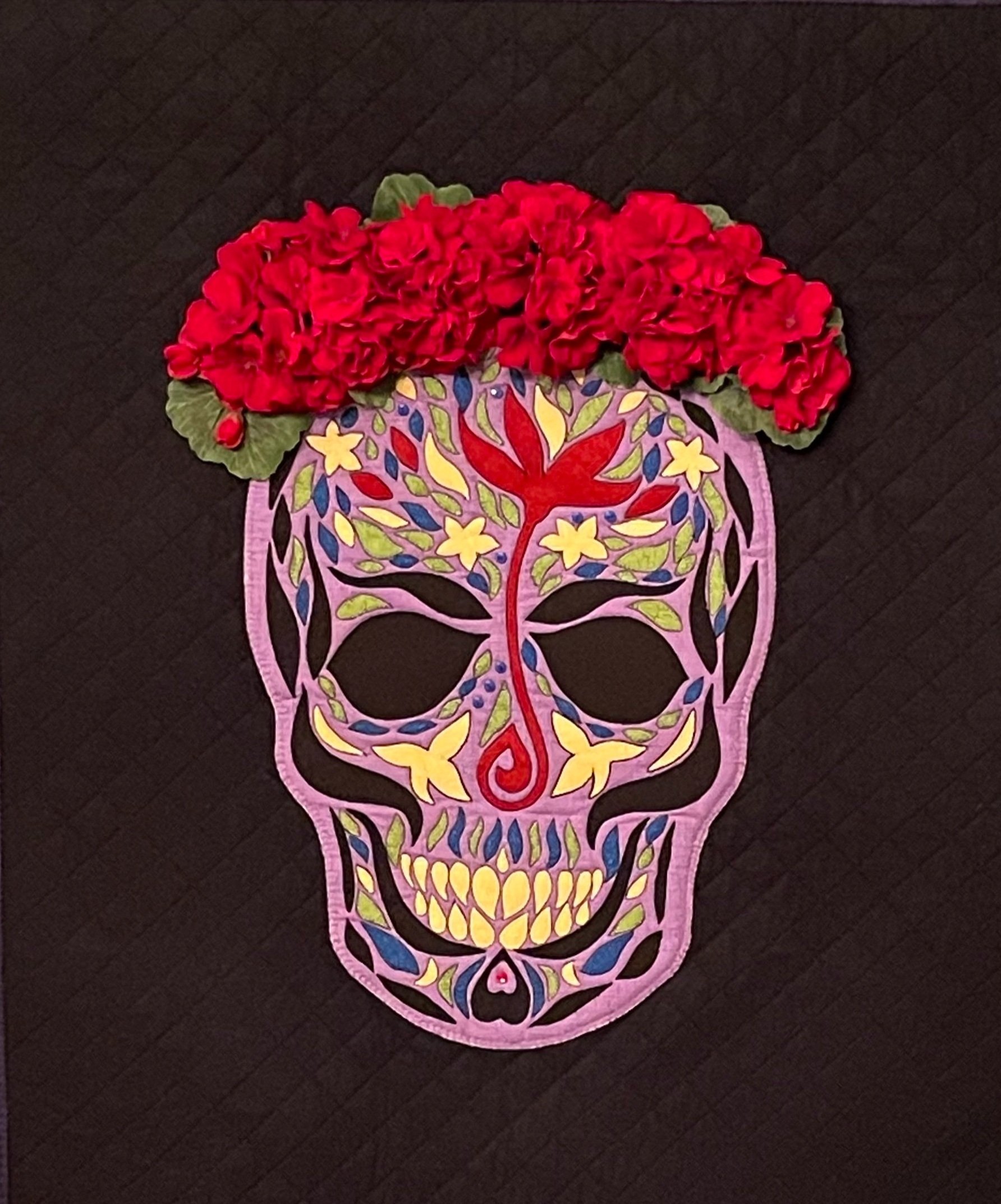
SUGAR SKULL SERIES: PURPLE SUGAR SKULL
With cheekbones to die for, subtle texture from buttons and beads, and a richly textured crown of red flowers, the contrast of the yellow and the purple creates a phosphorescent quality to the feminine shapes and forms used to create this face.

SUGAR SKULL SERIES: YELLOW SUGAR SKULL
From the dynamically shaped eyes embellished with tiny buttons to the intricate hand-cut filigree, the adorable curly blue mustache, and the visual impact of the flowers anchoring the skull at the forehead and chin, this face is a creative exploration of contrast and dimension.

SUGAR SKULL SERIES: BLUE SUGAR SKULL
From the delicate petals of the flowers to the supple texture of the leather, every element was chosen to craft a symphony of texture, color, and form. I chose the intricate arrangement of beads, buttons, and flowers to add depth and dimension to this face.
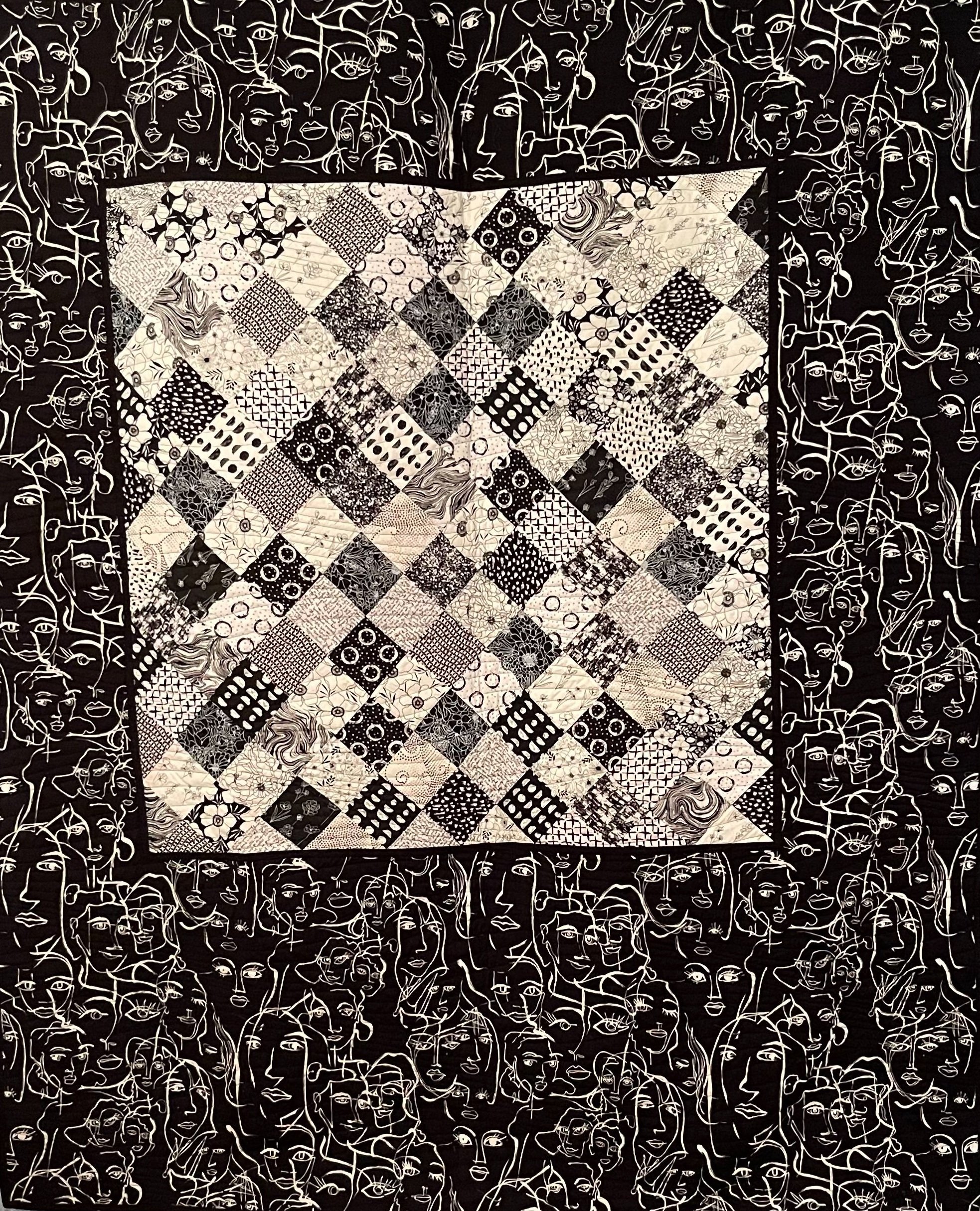
FACE-TIME
When I saw this Alexander Henry Material, I found the caricatures of female faces inspiring and waited for the right project to use them.
After working on the Tulips quilt, I was inspired to use a variation of the Missouri Star Quilt Company Squares On Point method as an applique to feature Alexander Henry’s fabric, allowing the pattern to remain unaltered as a design feature.

TULIPS
I came across Cheryl Wittmayer’s Tulip Wreath a decade ago – sporting undulating tulips with lovely curved stems, but I felt I could do better with the background that was included in the pattern.
A method from Missouri Star Quilt Company turned out to be the perfect foundation for the appliquéd tulips, and I enjoyed adding a feminist twist with the fabric choices I made with Squares on Point.
I loved the realistic play of the curved stems of the feminine flowers, and the beauty of the contrast of the shapes against the grid of the squares on point design.
If you’re lucky enough to sleep under this quilt, you will be surprised by the lovely faces and positive, inspirational quotes in the fabrics I chose for the back, as well.

WANDERLUST
The undulating, high-contrast lines of the quilting in “Wanderlust, ” inspired by a fabric sourced from an Australian company, evoke the spirit of adventure in the title and the urge to break free from everyday life and to experience something new and exciting.
The medallion that focuses and inspires the innovatively shaped piece came together over time, starting from a class at The Clearing in Wisconsin, and resurfacing with the inspiration of Susan Cleveland’s Prairie Points. The texture of the beads, and shells and the character of the multiple fabric prints add dimension to the medallion, bringing focus to the wandering spirit that it embodies.

RED/WHITE RUBY CELEBRATION QUILT
The non-traditional, modern style quilt pattern called "Confetti Squares" by [pattern maker] named “mamacjt” had been waiting on my to-do shelf for some time. It required the perfect challenge to bring out the dynamic and almost vibrating motion illusion of the design, and the Red/White Ruby Celebration Challenge was the perfect fit.
The variable dimensions of the red blocks, trick your eyes into perceiving the motion of falling streams of confetti through the illusion of undulating waves.